| Archive Blog Cast Forum RSS Books! Poll Results About Search Fan Art Podcast More Stuff Random |
|
Classic comic reruns every day
|
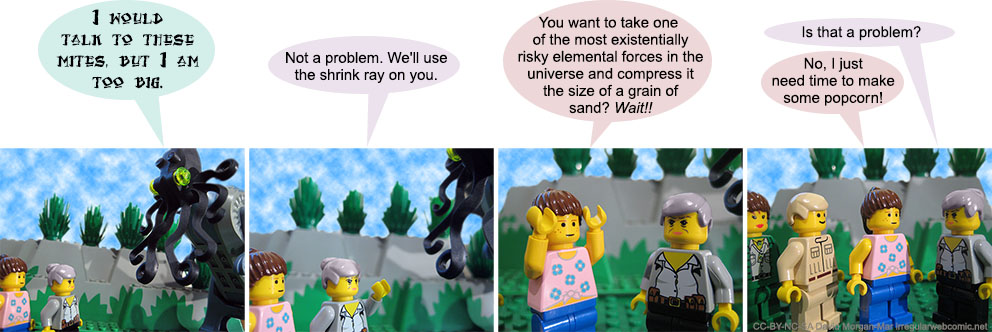
1 Cthulhu: I'd talk to these mites, but I'm too big.
2 Jane Goodall: Not a problem. We'll use the shrink ray on you.
3 Bonnie: You want to take one of the most existentially risky elemental forces in the universe and compress it the size of a grain of sand? Wait!!
4 Jane Goodall: Is that a problem?
4 Bonnie: No, I just need time to make some popcorn!
|
First (1) | Previous (3687) | Next (3689) || Latest Rerun (2874) |
Latest New (5380) First 5 | Previous 5 | Next 5 | Latest 5 Steve and Terry theme: First | Previous | Next | Latest || First 5 | Previous 5 | Next 5 | Latest 5 This strip's permanent URL: http://www.irregularwebcomic.net/3688.html
Annotations off: turn on
Annotations on: turn off
|
There have been some comments about the poor kerning between the letters "r" and "n" in the Arial font which I use for dialogue. If I just type a word like "popcorn" and let Photoshop do its thing, it comes out looking more like "popcom". Most people can read this fine as they expect a real word, and their brains just process it as intended, but it can get difficult with come cases such as "burn" versus "bum".
To help alleviate this, for a while now I've been inserting a small additional space between the letters "r" and "n" whenever they appear together in that order, to make the letter combination clearer and less ambiguous. In particular, I insert a space character and change it to the minimum point size that Photoshop allows (4 point), which seems to be decent enough. (I make the strips at a much larger original size and shrink them down to web size only right at the end.)
Thus the word "popcorn" in this strip has visibly separate letters "r" and "n". Although this makes it easier to read without ambiguity, it does (to my eyes at least) make the space between the "r" and the "n" look a tiny bit too big. I could potentially get more sophisticated and manually layout the individual letter positions and use anti-aliasing to effectively visually shrink the gap to a fraction of a pixel, but honestly I'm not going to go to that level of bother to fix a kerning issue every time it arises.
Another solution would be to change the default dialogue font. Though that would be a rather big change in the visual look of the comics, and I'm not quite prepared to go there at this point.
|
LEGO® is a registered trademark of the LEGO Group of companies,
which does not sponsor, authorise, or endorse this site. This material is presented in accordance with the LEGO® Fair Play Guidelines. |