| Archive Blog Cast Forum RSS Books! Poll Results About Search Fan Art Podcast More Stuff Random |
|
Classic comic reruns every day
|
1 {sketch of a scene on the Enterprise bridge}
1 Caption: Trying on Hats
|
First (1) | Previous (3335) | Next (3337) || Latest Rerun (2861) |
Latest New (5380) First 5 | Previous 5 | Next 5 | Latest 5 Annotations theme: First | Previous | Next | Latest || First 5 | Previous 5 | Next 5 | Latest 5 This strip's permanent URL: http://www.irregularwebcomic.net/3336.html
Annotations off: turn on
Annotations on: turn off
|
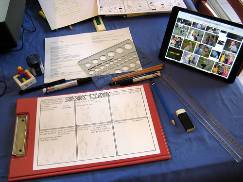 Tools of the trade. My drawing area, in the middle of initial pencil work. |
Firstly there are some general points about publishing a webcomic which I already knew well enough from previous work. Keep a predictable publishing schedule and stick to it like clockwork. Keep a buffer of strips waiting and ready to go. Don't sweat it that one strip might not feel as good as previous work, let it out the door and start work on the one after that. Don't expect fame or fortune to follow your footsteps.
The earliest new thing I learnt was what drawing materials to use. I went to a local art supply shop, looking for Bristol paper, which is a thick, almost card-like paper with a slightly rough surface, good for pencil drawing. This is usually the recommended paper for people to sketch in pencil and comes up a lot in "how to draw cartoons" guides.
I'm not sure exactly why, but the place didn't have anything labelled as "Bristol" paper. I found some stuff which I thought looked right, but it didn't have that word on it. So I asked the shop assistant. "Bristol paper? Well, this stuff you're looking at is the closest thing. What do you want it for?"
"Drawing cartoons and then inking them with marker pens," I said.
"Oh! If you'll be using markers, then I have the perfect stuff! It's called blending card and it's really smooth and perfect for markers. The ink doesn't bleed and you get nice sharp lines. Here, it comes in single sheets for a dollar each, or packs of ten for $9.50."
I looked at the card and it was beautiful stuff. Smooth as silk but with a matte surface, and a decent weight to it. But a dollar for an A4 sheet sounded awfully expensive. So I went back to the shelf of almost-Bristol paper and checked the price of that. A pad of that containing 16 A4 sheets turned out to be $23 or something. Okaaaay... So the blending card it was. I bought two packs of ten sheets.
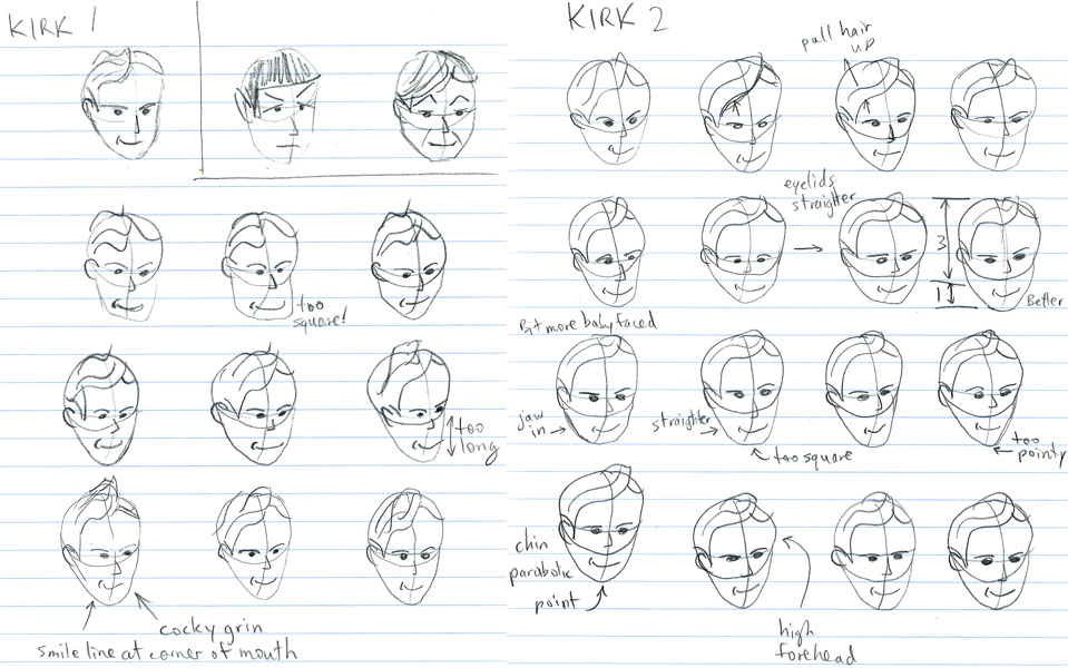 Initial sketches for Kirk. These are just the first two pages - I did eleven pages of these. |
Then I needed marker pens. I got two Artline fine tipped black markers, 0.2 and 0.4 millimetre tips, and Artline 700 series marker with a 0.7 millimetre rounded tip, and a big fat Artline 90 marker with a wide chisel tip. I'd be drawing in black only, so didn't need any colours.
When I got home I sat down to draw my first strip. But first I checked a "how to draw comics" book to see if my pencils were right. It said for sketching which is going to be inked over, you're better off using harder pencils, because they make lighter lines! Oh well. So I have ended up using the HB pencils for my rough work. But the 2Bs are not wasted; I use those for rough sketches on separate pieces of paper to determine layouts for tricky panels.
Speaking of rough sketches... The next step was not drawing a comic, but sketching characters. I had a general procedure from one of my books. Draw a circle for the head, then extend it into an oval or egg shape by adding a line for the chin. Make it a three dimensional solid by adding a curved longitude line down the middle of the face, and draw a curved equator line where the eyes and ears go. Then start adding facial features.
For an ongoing comic you want recognisable characters. For a Star Trek comic, you want a central cast consisting of Kirk, Spock, and McCoy. I had to come up with my own cartoon representations for these three characters which would be consistent and recognisable. I started by sketching Kirk's face. Over and over. And over. It turned out this was a bad place to start, as I definitely had the most trouble making my sketches into a recognisable Captain Kirk. Spock and McCoy were pieces of cake in comparison, since their faces are so distinctive. Kirk is much more bland and generic, facially speaking, and nothing I did seemed to capture his swishy, sideways combed hairstyle.
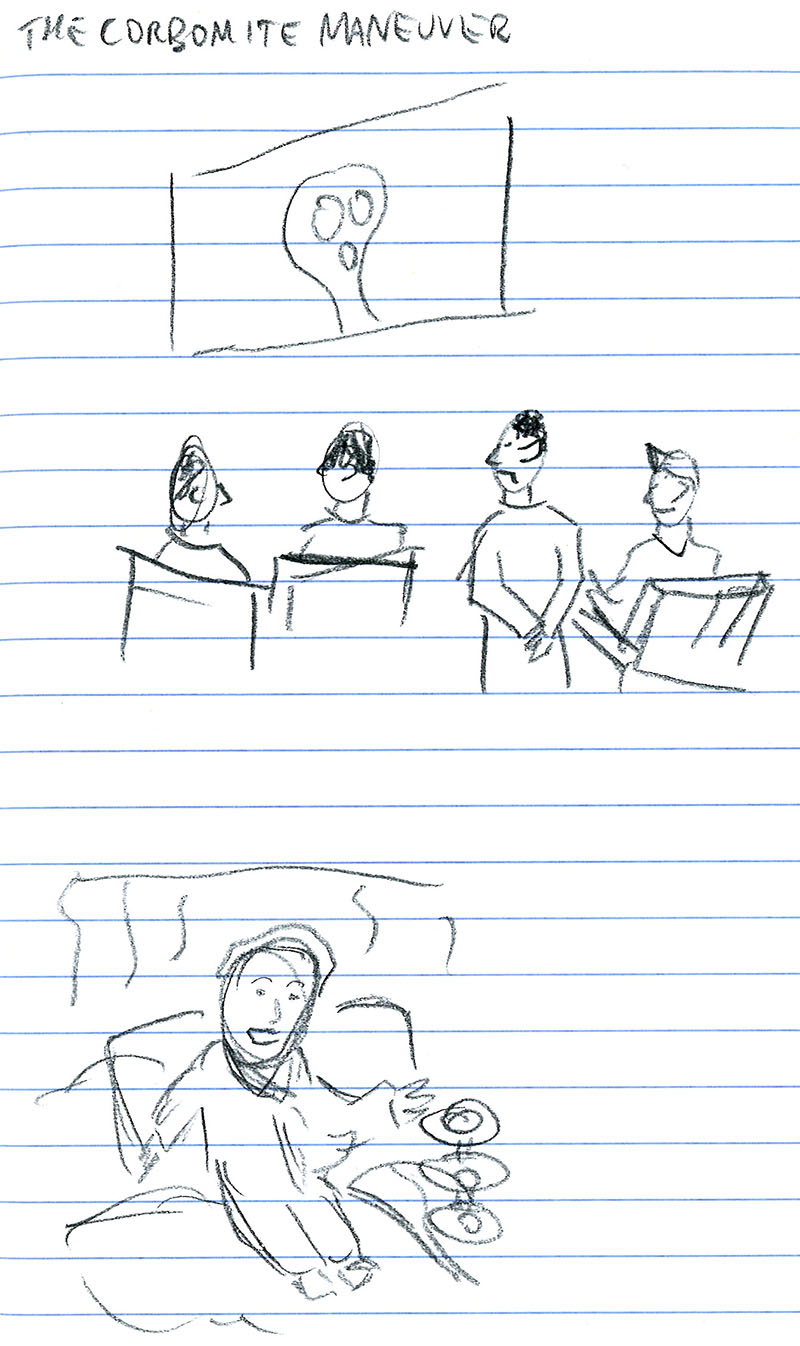
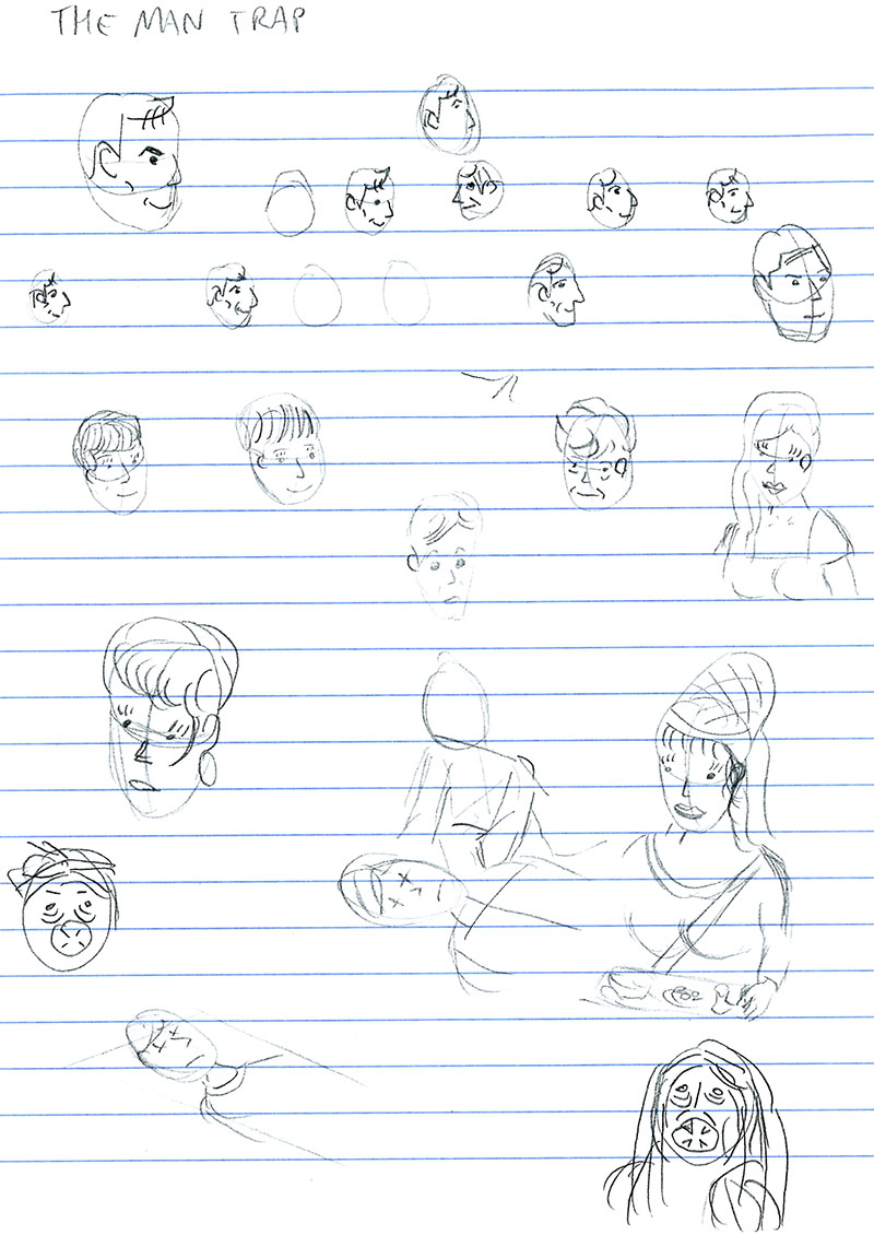 Sketches for the first episode: "The Man Trap". |
Spock was relatively simple. I gave him a longer face, a pointy ear, upswept eyebrows, and voilà! He is also consistently taller than Kirk, and usually stands with his hands behind his back. This is not because hands are hard to draw - they are, but Spock's hands are usually hidden for character reasons.
McCoy was a little more tricky, but I nailed his appearance with just a few sketches. He has a very octagonal jaw. I wanted his hair to be very distinctive between Kirk's blank blond and Spock's solid black, so I went for closely spaced wavy lines. And for extra distinctiveness, he has unfilled circles for eyes, and wears short sleeves. In the show, McCoy only wears short sleeves sometimes, when performing more hands-on medical duties. In my comic, he never changes his costume. For what would Charlie Brown be without his zig-zag shirt, or Calvin without his striped shirt? An unchanging costume is a comics trope, and helps maintain continuity.
With the three main characters developed, I felt ready to tackle the first strip. Now I had to decide on a layout format. I was drawing inspiration from Shaenon Garrity's Monster of the Week, the source of my idea for Planet of Hats. I didn't want to copy her layout exactly, but twelve panels seemed like a good number. She draws four per sheet in portrait orientation, with three sheets per comic. I decided I wanted my finished strip to be wider but shorter vertically. So I went for landscape orientation with three panels across, and six panels per sheet, meaning just two sheets per comic. I decided to put the title across the top rather than use up a panel for it.
So I ruled up six equal sized panels in pencil, added the title text, then inked them with the 700 marker. By this time I had a script for my first comic. It was when I thought about starting to draw that I realised I would have to lay out the text first, to ensure I left enough room for it with my artwork. I'd never faced this problem before when using other forms of artwork for comics - the text always got laid over the top of whatever was there. So I realised I had to think about the composition of the art, imagine where the text would go, then actually write the text first in those imaginary spaces, before drawing the art around the text.
I had decided to handwrite my dialogue text, rather than lay it out electronically later using a text font in Photoshop, so this step of laying out the text first was even more important. As usual, I had written more dialogue than could be squeezed in, so as I was writing it with the 0.4 mm marker, I was actively editing and cutting parts of the text. Dialogue in all my comics usually goes through several rewrites - in almost every case making the text shorter. One extremely useful lesson I've learnt over years of making comics is: Use fewer words.
My handwriting is a bit messy, but hopefully legible enough. Over the course of a few strips I settled on a size which I at least could read on my screen when the strip was scanned and shrunk down to the final size. To write the text I rule pencil lines 6 mm apart on the sheet. I dare not try to write any without a pencil guideline.
 Completed first page for "The Man Trap", before cleaning up and adding colour in Photoshop. Yes, I stuffed up inking the title. |
That was not all of the drawing work done, however. At this stage the backgrounds looked very sparse, so I now went back and filled them in a bit, using the 0.2 mm marker to produce thinner lines. This echoes a well-known optical effect, that objects further away look faded, or less contrasty than nearby objects, because of atmospheric scattering. It's most noticeable at long distances, but the effect can still be used to subconsciously affect people's perception of depth in artwork for smaller distances. As a photography researcher I know the principle very well, and notice it in other people's artwork. Artists use it, either consciously or perhaps subconsciously or simply through art training.
The final steps in production are scanning and finishing in Photoshop. I decided to add spot colour to the Starfleet uniforms, as these are such a distinctive part of the Star Trek universe. A bonus was that the colours would help identify some of the characters more easily. I tried a solid fill, and then experimented with various graduated edge effects until I was pleased with the result. I extended the colouring to include clothes other than Starfleet uniforms, but resisted the urge to colour everything. I think the spot colour gives the comic a distinctive look, which is not a bad thing to have when trying to create something new and memorable.
Once I'd finished the first comic there came a very important step: starting the second comic. This is a harder thing than it sounds. Doing something once is easy compared to doing it over and over again consistently. I stuck to a schedule of watching the next episode of Star Trek on Sunday, mulling over the script for the comic and possibly writing snippets of dialogue during the week, finalising a script on Saturday morning, and completing pencil work for the comic by Saturday evening. Sometimes I could also ink on Saturday, sometimes I needed to do it on Sunday. At first, drawing the pencil sketches for a single strip took about five to six hours of work. I got faster, and now I'm drawing a strip in about three to four hours. It's a significant chunk of time to dedicate to a project every single week, but I knew that when I started.
Over the few weeks that I've now been doing this, a few things have evolved already. I started drawing the circles for character heads by hand, but found I was not good at drawing circles freehand. Some ended up squashed or irregular, and I spent a lot of time erasing and redrawing them. So I got myself a drawing template with a bunch of different sized circles in it and started using that. It saves time and the results are neater. I also considered getting an ellipse template for the times I need to draw ellipses (such as the Enterprise saucer at an oblique angle, or the transporter pads), but that doesn't come up enough to justify a $20 piece of technical drawing apparatus. I also thought about using French curves to let me draw smooth speech bubbles, but I decided just to be a bit more careful when inking those in (hopefully they have gotten smoother since the first strips!).
I was very pleased with the fourth strip I drew, "The Naked Time". I liked the gag gimmick I came up with, and I liked the drawings I did. Once it was done though, I had to start work on the next strip. I wasn't as excited about it and I don't think it turned out as well. But one thing about producing something to a schedule is that you just have to keep going, and push those mediocre follow-ups to better material out the door. You can't afford to get hung up thinking, "this isn't as good as the last one, I need to work on it more." That way lies frustration and abandonment. My friend Andrew made me conscious of this aspect of creativity some time ago, and he often talks about it as a crucial aspect of making creative things. When you're being creative, some of your stuff will not be great. You just have to suck it up and keep creating. It's a good lesson to learn.
So has my drawing improved over ten weeks of scheduled practice? I'm not sure yet. Some weeks it's better than others. I want to let the longer term smooth over some of the short term bumps still. Maybe by the end of 79 episodes I'll revisit this question. I hope to see you there.
|
LEGO® is a registered trademark of the LEGO Group of companies,
which does not sponsor, authorise, or endorse this site. This material is presented in accordance with the LEGO® Fair Play Guidelines. |