|
Archive
Blog
Cast
Forum
RSS
Books!
Poll Results
About
Search
Fan Art
Podcast
More Stuff
Random
Support on Patreon |
|
New comics Mon-Fri; reruns Sat-Sun
|
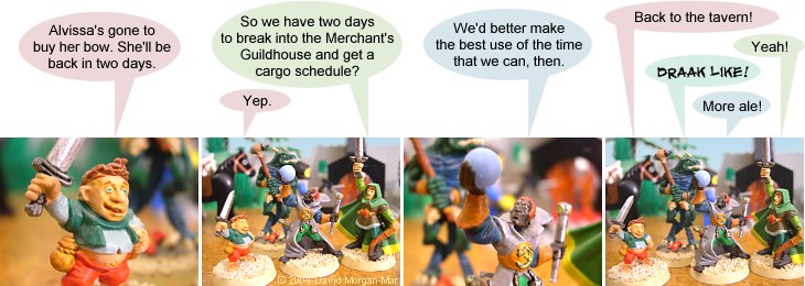
1 Lambert: Alvissa's gone to buy her bow. She'll be back in two days.
2 Mordekai: So we have two days to break into the Merchant's Guildhouse and get a cargo schedule?
2 Lambert: Yep.
3 Kyros: We'd better make the best use of the time that we can, then.
4 Lambert: Back to the tavern!
4 Mordekai: Yeah!
4 Kyros: More ale!
4 Draak: Draak like!
|
First (1) | Previous (593) | Next (595) || Latest Rerun (2581) |
Latest New (5175) First 5 | Previous 5 | Next 5 | Latest 5 Fantasy theme: First | Previous | Next | Latest || First 5 | Previous 5 | Next 5 | Latest 5 This strip's permanent URL: http://www.irregularwebcomic.net/594.html
Annotations off: turn on
Annotations on: turn off
|
Just when you thought we'd left the tavern and really begun some sort of adventure...
Thankfully, humans are very good at reading whole words from the overall letter shapes, rather than reading letter-by-letter. So almost all of you would simply read that word as "tavern", and not get confused with the nonsense word "tavem" that it looks like.
But nonetheless, this started to annoy me as the years went by. In later strips, you might notice that for similar incidences where the letters "r" and "n" abut like this, I have actually separated them slightly. I did this by inserting a space character in the dialogue and reducing the font size of the space to the minimum possible in Photoshop, to leave a tiny but detectable space between the "r" and "n". The difference is very subtle, but enough to make it much less likely to be read as the single letter "m".
In most cases this wouldn't actually be a problem, as the alternate reading wouldn't even make sense as a word. There are some cases, such as "darn" and "dam", where both alternatives are English words, but even then the context of the surrounding sentence would usually be enough to disambiguate the words, and most people would read it smoothly without even noticing.
Writing about it now, I'm not sure why I ever bothered inserting that tiny space. I'm guessing none of you ever noticed it or, alternatively, would have noticed any problem if I hadn't done it.
EDIT: The process of adjusting the spaces between letters is known as kerning. Or keming, if you're not careful.
|
LEGO® is a registered trademark of the LEGO Group of companies,
which does not sponsor, authorise, or endorse this site. This material is presented in accordance with the LEGO® Fair Play Guidelines. |